
|
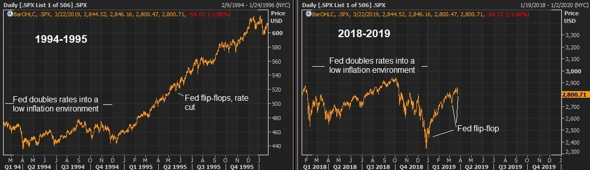
March 27, 5:00 pm EST We’ve talked this week about the yield curve inversion. In response, the market is now pricing in a better than 70% chance of a rate cut in June. And Trump’s new pick to join the Fed, Stephen Moore, has said the Fed should cut by 50 basis points immediately.We’ve talked about the comparisons between 2019 and 1995. In 1994 the Fed aggressively tightened into a low inflation, recovering economy (as they did in 2018). By the middle of 1995, they were cutting. Stocks finished the year up 36%. Given the contrast of where the Fed has positioned themselves now, compared to just three months ago, they have effectively eased — and we can see it clearly manifested in the interest rate market. The 10-year U.S. government bond yield has gone from 3.25% to under 2.5% since just November. I would argue we already have a repeat of 1995. Here’s a look, in the chart on the left, at what stocks did in 1994-1995, when the Fed transitioned from
|
 |
|
Within a few quarters of the ’95 rate cut, U.S. growth was printing above 4% and did so for 18 consecutive quarters. Stocks tripled over that period. Join me here to get my curated portfolio of 20 stocks that I think can do multiples of what broader stocks do, through the end of the year. |